A designer builds a services page. The hierarchy is clean, the rhythm is good, the sections flow into one another. Read top to bottom, it works.
Then an AI system pulls out one section, roughly 200 words, and quotes it to someone who has never seen the rest of the page. Out of context, the section reads: "This approach reduces delivery time significantly. It has worked for clients across several sectors."
Which approach. Which clients. Which company. The passage is fluent, well set, and useless. That is the failure mode this article is about, and it is a design problem long before it is a writing problem.
AI systems do not read pages the way a person does. They retrieve passages. Content is broken into chunks during retrieval, and per Anthropic's contextual retrieval research those chunks are typically no more than a few hundred tokens, with passage-level retrieval commonly landing between 100 and 300 words.
Anthropic's own example of a chunk that fails is worth sitting with:
"The company's revenue grew by 3% over the previous quarter."
Perfectly clear inside a document. Retrieved on its own, it does not say which company or which quarter, which makes it hard to retrieve accurately and harder to use. The research calls this out as a core reason retrieval breaks.
The practical consequence for design is direct. Your page is not the unit of delivery. Your section is. Every section will eventually be lifted out and read alone, and it either survives that or it does not.
1. Headings are chunk boundaries, so give each section exactly one question.
Chunk boundaries follow semantic logic, and headings are the strongest semantic signal a page has. A section that covers three loosely related things will be split badly or retrieved incompletely. One H2, one question, one answer. If a section needs two answers, it needs two sections.
2. Put the answer in the first two sentences.
Most editorial writing builds toward its point. Extraction rewards the opposite. The direct answer belongs immediately under the heading, with the context, nuance and examples following it. This is the inverted pyramid applied at section level rather than page level, and it also happens to be better for the human skimming on a phone.
3. Repeat the entities. Kill the orphan pronouns.
Inside a section, avoid "this approach", "the team", "as we saw above", "it". Those references resolve against content the retrieval system will not include. Name the company, name the service, name the timeframe, every section. It feels repetitive when you read the page start to finish. It is the difference between a citable passage and an unusable one.
This is where designers and copywriters have to agree, because the instinct in both crafts is to avoid repetition.
4. Use real headings, not styled divs.
A heading that is a div with a large font size carries no structural meaning. Extraction relies on document structure, and a page where hierarchy exists only visually has no hierarchy at all as far as a machine is concerned. One H1. H2 for sections. H3 nested under H2, never skipping a level for aesthetic reasons.
Heading text should state the subject of the answer rather than being clever. "How long a website project takes" outperforms "The waiting game" every time, and it costs nothing but a little ego.
Most design advice on this subject is wrong in one direction or the other. It is either "accordions are fine" or "never hide anything". Neither is right, and the real rule is simple.
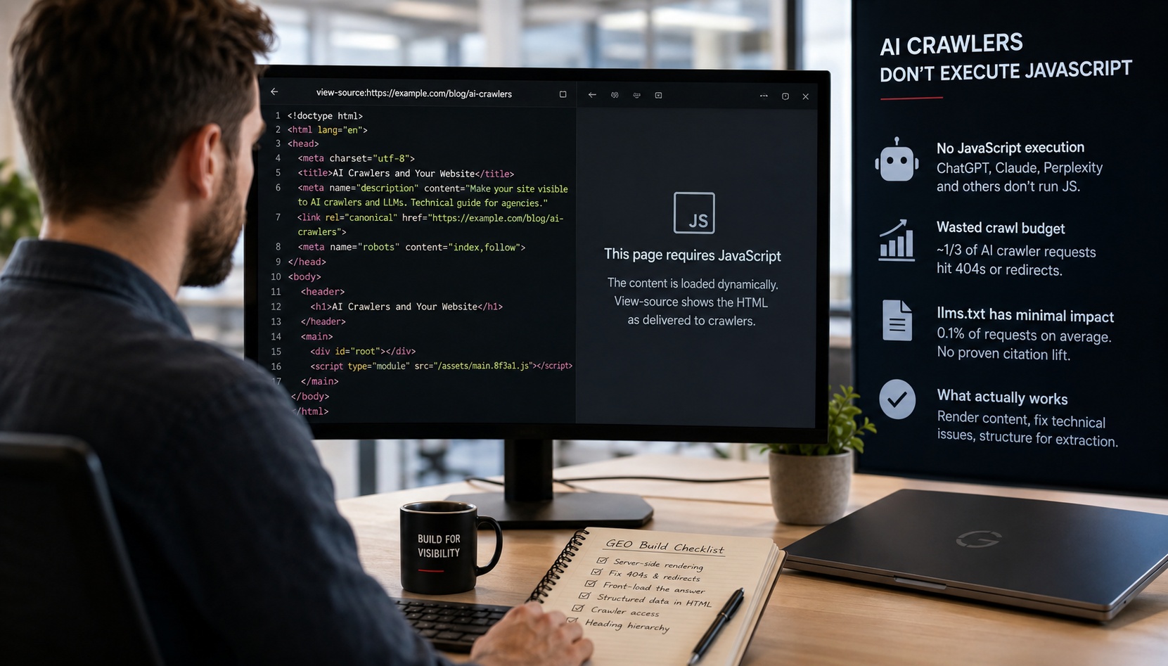
What matters is whether the content is in the initial HTML, not whether it is visible.
Content hidden with CSS but present in the HTML on page load is crawlable and indexable. Google has stated this directly. An accordion that ships its answers in the markup and collapses them with CSS is readable.
Content injected by JavaScript after a user interaction is a different matter entirely. If the answer only arrives after someone clicks, it may never be accessed at all, and for AI crawlers specifically the situation is worse: none of the major ones execute JavaScript, so anything dependent on a click event is invisible by definition.
So the design rules per component:
None of this means expose everything. One documented test took hidden FAQ content and made it fully visible: sessions fell 21%, engagement time fell 63%, impressions fell 4%, and rankings declined. Dumping every answer onto the page in the name of machine readability made the page worse for the humans it was built for, and performed worse as a result.
The resolution is not a compromise, it is a distinction. Primary answers, the ones you actually want cited, belong visible and high in the page. Secondary and supplementary material can sit in collapsible components, provided it ships in the HTML. Collapse is a tool for managing attention, not a place to store the things that matter.
This is the part that gets skipped. None of the above holds if it depends on individual designers remembering it. It has to live in the components.
These are Figma and design system decisions. They are made months before anyone writes a word of the content that will be extracted.
Take any section of a design, on its own, and ask:
Six questions. If a section fails two or more, it will not be cited, however good it looks in the mockup.
We build design systems and production templates for agencies, in white label. Increasingly the brief includes this: not just how the page looks, but whether its structure survives being taken apart by a machine. It sits alongside the render path and the crawl surface as part of the same question, which is whether a client's site can be read at all.
Send us one page, a Figma frame or a live URL. We will mark up which sections survive extraction, which ones collapse out of context, and what to change in the component rather than in the copy. No charge, 48 hours. See our UX and UI work, or how we work with agency partners in white label.
Genesis Agency Insight: The quickest way to test a design for this is to read one section aloud to a colleague who has not seen the page, and stop there. If they ask "which one?" or "whose?", the section will not survive extraction either. It takes about a minute per section and it catches more than any tool we have used.


Whether you need to redesign your website, boost your social media presence, or launch high-performing advertising campaigns, we are here to support you. Free 30-minute strategic consultation to discuss your challenges, no commitment, no pressure. Just an honest, useful conversation.


.svg)
.png)